
What Is a Baby Growth Percentile? (WHO Charts)
"A growth percentile is a rank in a healthy reference population, not a score or a grade. Here's what the pediatrician's number really means, and when to pay attention to it."

It happens at every well-baby visit. The pediatrician weighs your baby, glances at a chart, and says something like “she’s tracking at the 78th percentile for weight,” then moves on. You smile and nod, and for the rest of the day the question circles: is 78 good? What does it even mean?
Here’s the short version: a growth percentile is a rank, not a grade. The 78th percentile means your baby is heavier than roughly 78 out of 100 healthy babies of the same sex and age, and lighter than the other 22. It is not a score on a test. It is not 78% of some ideal weight. A high percentile is not a prize, and a low one is not a failure. It describes where your baby sits in the range of healthy growth, and healthy babies sit everywhere along that range.
That range comes from a specific place, and knowing how it was built turns the number from a mystery into something you can actually use. Most explanations skip this part.
How the curves are built
The growth standards, published in 2006, are four sets of smoothed curves: weight-for-age, length-for-age, weight-for-length, and head circumference-for-age, drawn separately for boys and girls. Each chart is a fan of lines. The middle line is the median, the 50th percentile. Around it run the 15th and 85th, then the 3rd and 97th. Together they divide the chart into channels, and that word, channel, is the one that matters most.
The curves come from the Multicentre Growth Reference Study, which followed roughly 8,500 children in Brazil, Ghana, India, Norway, Oman, and the United States between 1997 and 2003. The children were breastfed according to the study’s recommendations, lived in households with good health practices, and grew up in conditions that did not hold growth back. The result is a description of how healthy children grow when conditions are good, not an average of how children happened to grow wherever they were measured. That design is what makes the standards prescriptive rather than descriptive: they say what growth should look like, which is why the same charts are used from rural clinics to university hospitals.1
Underneath the smooth lines sits a lot of math. Each day of life is encoded as three numbers, the so-called LMS parameters: a skewness term, the median, and a coefficient of variation. From those three values, any weight can be converted into an exact percentile, which is how Storklet plots your baby’s measurements on the same curves your pediatrician reads.2 The lines look simple. They are not guesses.
Reading the fan
Here is the weight-for-age fan for boys from birth to 24 months, generated from the same tables Storklet ships in the app, with two example babies drawn on top:
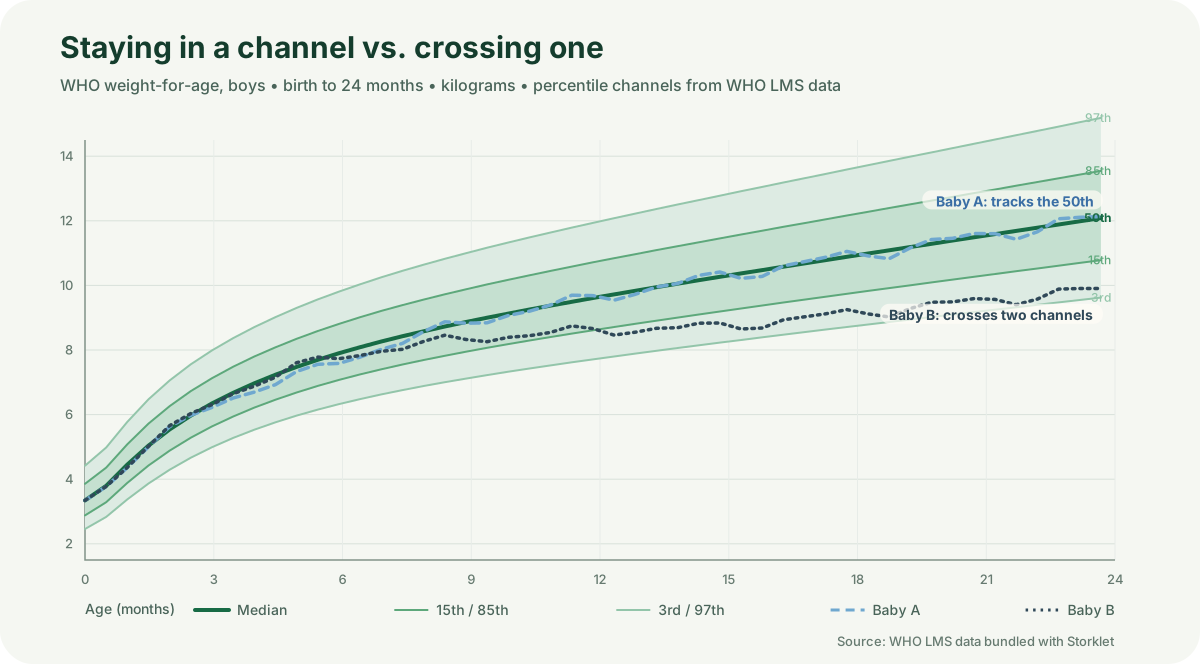
Baby A (blue, dashed) tracks the 50th percentile with the small wobbles every real baby has. Baby B (dark, dotted) also starts near the median, then drifts down across the 15th percentile band over the first two years. Notice what the chart is actually showing. Both babies gain weight the whole time. Neither line is flat, and neither baby is “failing” at any single point. The difference is in what happens to the channel.
Three things to take from the fan:
- Percentiles are computed separately for boys and girls, because healthy growth differs between the sexes.3
- The 50th percentile is the median: half of healthy babies weigh more, half weigh less. It is the middle of the range, not the goal.
- Roughly 94% of healthy babies fall between the 3rd and 97th percentiles.4 Sitting outside that band is a flag for a closer look, never a diagnosis on its own.
The mental model that keeps parents sane: the percentile describes a position in a healthy range, and that is all it is.
What the number does and doesn’t tell you
A single point is weak evidence. Scales differ, readings wobble, babies get weighed at different times of day, and one visit catches a snapshot. Patterns over months are strong evidence. That is the whole reason pediatricians chart growth instead of reading numbers.
Percentiles also drift within reason. Many healthy babies shift a band or two in the first year as they settle into their own trajectory. A drop from the 60th percentile to the 40th over six months is usually just life. A drop from the 60th to the 10th over the same span is a conversation worth having. The difference between those two is the difference between noise and a trend.
When a change in the curve matters
Pediatricians watch for three patterns. The first is persistent channel-crossing: a baby who steadily falls across two or more major percentile bands over several months. That is a pattern, not a point. The second is an extreme combined with symptoms: being below the 3rd percentile is not itself an illness, but paired with poor feeding, lethargy, or other signs, it becomes part of a bigger picture. The third is stalling velocity: if weight stops following any curve over weeks, flattening while the reference fan keeps rising, that flat line is the signal.
In all three cases, the right move is a conversation with your pediatrician, not a spiral of midnight research. The doctor has the full history, the other three charts, and the clinical context a percentile alone cannot carry.
When to bring it up
You do not need a scary number to call. You need a trend that does not look like your baby. If your baby is gaining, feeding, and hitting developmental milestones, a low percentile on its own is not an emergency. If weight is crossing channels, appetite has dropped for more than a few days, or you simply feel something is off, say so. “I noticed she’s dropped from the 40th to the 15th percentile” is a good way to open the conversation. So is “her curve looks different than her brother’s did.”
What you should not do is wait until a number sounds alarming. Pediatricians look at all four charts together, over time, in the context of your baby’s actual feeding and energy. One number, even an extreme one, is a starting point, never a verdict.
Tracking growth the way the charts intend
The single most useful thing you can do between visits is record measurements consistently: same scale, same time of day, roughly the same intervals, every time. One weight reading tells you where your baby sits. Six readings over six months tell you where your baby is going, and that trajectory is what the curves are for.
That is what Storklet’s growth tracking is built around. Every measurement is plotted against the real growth curves, so your baby’s trend line sits directly on the same fan your pediatrician reads: updated the moment you log it, available offline, and kept private on EU-hosted servers with no ads and no export of your data to advertisers. Growth, feeding, sleep, vaccines, and milestones live in one place, shareable with unlimited caregivers.
Start with a free 14-day trial and see your baby’s curve take shape.
Sources and Further Reading
We base our explainers on high-quality academic research and public health standards.
- The study set out to establish “the breastfed infant as the normative model for growth and development.” Children were included only if they were singletons born at term, had no significant illness, lived in non-smoking households, and were breastfed per WHO recommendations, so the curves describe ideal conditions, not average ones.↩
- “LMS” stands for the Box-Cox power (L), the median (M), and the coefficient of variation (S). WHO publishes one set of LMS values per day of age, so any measurement converts to an exact z-score without eyeballing a printed chart.↩
- The standards publish separate charts for boys and girls because growth genuinely differs between the sexes; weight-for-age, length-for-age, weight-for-length, and head circumference each have their own pair. WHO Child Growth Standards↩
- The 3rd and 97th percentile lines sit at roughly two standard deviations from the median, which is why about 94% of healthy babies land between them. The outer bands are screening flags, not diagnosis. WHO growth standards: rationale and methods, Acta Paediatrica 2006↩
Read Next
Baby Tracker for Two Phones: Sharing Care With Your Partner
Every 'did she eat?' text is a missing record. One shared baby log on both phones ends the check-ins, the handover briefings, and the 3 a.m. guessing."
Newborn Feeding Schedule by Age: Full First Year
There is no single newborn feeding schedule. There are two rulebooks, one for breastfed babies and one for formula-fed babies, and a shape the first year follows. Here it is, with the numbers and the why.